타베로그를 크롤링하기3 - 타베로그 데이터 까보기
- 타베로그를 크롤링하기
- 타베로그를 크롤링하기2 - Google Places API로 비교하기
- 타베로그를 크롤링하기3 - 타베로그 데이터 까보기
- 타베로그를 크롤링하기4 - 구글 데이터 까보기
데이터를 드디어 다 모았습니다
험난한 과정 끝에 30달러짜리 데이터를 모았습니다(왜 30달러인지는 타베로그를 크롤링하기2 - Google Places API로 비교하기 를 참고하세요). 별거없는 코드이긴 한데 엑셀파일을 하나 떨궈주니 참 뿌듯하긴 하네요. 이제는 그 내용을 한번 까볼 시간입니다.
데이터는 3월 23일 19시 30분 기준으로 타베로그에 등록된 삿포로시의 식당들을 검색하여 수집하였습니다. 타베로그 사이트의 한계로 최대 60페이지까지밖에 검색이 안 되어 총 1240개의 식당의 정보를 수집할 수 있었습니다. 크롤링한 식당의 이름을 바탕으로 Google Places API를 이용하여 구글에 등록된 정보를 수집하였습니다. 그 결과 최종적으로 총 1164개 식당의 정보를 수집하였습니다. 수집한 데이터의 항목은 아래와 같습니다.
name: 점포명rating: 유저가 타베로그에 남긴 평점의 평균, 0점~5점, 결측치는 -1로 표시reviews: 유저가 타베로그에 남긴 평가의 갯수price_night: 점포의 저녁식사 가격대, 결측치는 -1로 표시price_noon: 점포의 점심식사 가격대, 결측치는 -1로 표시google_place_id: 구글 Places API에서 부여하는placeid. 분석에는 전혀 쓰이지 않을 예정이지만 억울해서 수집google_rating: 구글에 유저가 남긴 평점의 평균, 0점~5점, 결측치는 -1로 표시google_user_ratings_total: 구글에 유저가 남긴 평가의 갯수google_review_en: 수집한 리뷰 중 영어 리뷰의 갯수, 최대 5개
사이트별로 분석해보기
먼저, 각 사이트별로 데이터를 분석해보겠습니다.
Tabelog
평점
평점이 없는 가게는 제외하고, 평점의 분포를 보면 흥미롭습니다.
import matplotlib.pyplot as plt
import numpy as np
from scipy.stats import gaussian_kde

def plot_dist(columns, labels, colors, do_log, include_missing, title):
    for col, label, color, log in zip(columns, labels, colors, do_log):
        # 데이터 뽑기
        data = google_tabelog[col]
        if not include_missing:
            data = data[data != -1]
        # 필요하면 데이터에 로그도 씌워줍니다
        if log:
            data = np.log(1 + data)

        # 히스토그램을 그려줍니다
        plt.hist(data, density=True, color=color, alpha=0.7, label=label)

        # 확률밀도함수를 그럴듯하게 그려줍니다
        # Gaussian Kernal Density Estimation을 사용합니다
        density = gaussian_kde(dataset=data)
        density_x = np.linspace(np.amin(data), np.amax(data), 100)
        density_y = density.evaluate(density_x)
        plt.plot(density_x, density_y, '--', color=color, alpha=1.0)

        # 만일 데이터에 로그를 씌웠다면
        # x축을 로그 스케일로 고쳐줍니다
        if log:
            old_axes = plt.axes()
            old_axes.xaxis.set_major_locator(plt.LogLocator(base=np.e))
            plt.sca(old_axes)
            dx0, dx1 = np.amin(data), np.amax(data)
            ticks = np.linspace(dx0, dx1, 5)
            plt.xticks(ticks=ticks, labels=['{:d}'.format(int(x)) for x in np.exp(ticks)])

    plt.title(title)
    plt.legend()
    plt.savefig('tmp/{:s}.png'.format(title))
    plt.show()

plot_dist(columns=['rating'],
          labels=['Tabelog'],
          colors=['#2c7bb6'],
          include_missing=False,
          title='Histogram of Tabelog Ratings in Sapporo'
          )
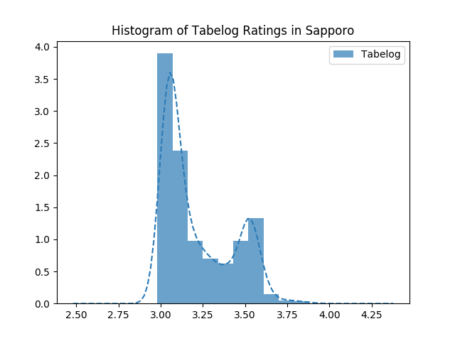
첫째, 평점이 대부분 3점~4점대입니다. 어쩐지 타베로그에서는 죄다 3점대뿐이라더니. 3점대 가게라도 안심하고 들어가서 먹을 수 있을 것 같습니다. 둘째, 쌍봉 분포를 보이고 있습니다. 3점대 초반의 가게와 3.5 후반의 가게로 양분화되어있습니다.
요 쌍봉 분포가 좀 특이해서, 혹시 ‘평범한 가게’와 ‘맛집’을 구분할 수 있을지 궁금해졌습니다. 즉, 평점 몇 점을 기준으로 ‘평범한 가게’와 ‘맛집’을 구분할 수 있을까요? 정확한 값은 구할 수 없을 거라고, 아니 정의할 수도 없을 것 같지만, Gaussian Mixture Model을 가정하면 경계값 정도는 구할 수 있을 것 같습니다. 전체 분포에 대하여 군집이 2개(맛집 vs 평범)라고 가정하고, 공분산 모델을 Full이라 했을 때 Gaussian Mixture Model에 의한 분류를 해보았습니다.
import matplotlib.pyplot as plt
import numpy as np
from sklearn.mixture import GaussianMixture

def gaussian_mixture_model(column):
    data = google_tabelog[column]
    data = data[data != -1]

    # Gaussian Mixture Model을 연산해줄 객체를 생성합니다
    # Scikit-learn 덕분에 EM 알고리즘을 직접 구현하지 않아도 됩니다
    gmm = GaussianMixture(n_components=2, covariance_type='full', tol=1e-6, max_iter=100000)
    gmm.fit(X=np.reshape(data.values, (-1, 1)))

    # 수렴이 안 되면 어쩔 수 없죠
    if gmm.converged_:
        x = np.linspace(np.min(data) - 0.1, np.max(data) + 0.1, 100)
        # 공분산에 대한 가정에 따라 튀어나오는 공분산의 배열 형식이 달라서 어쩔수가 없습니다
        if gmm.covariance_type == 'full':
            cov1 = np.sqrt(gmm.covariances_[0][0][0])
            cov2 = np.sqrt(gmm.covariances_[1][0][0])
            y1 = norm.pdf(x, loc=gmm.means_[0][0], scale=cov1)
            y2 = norm.pdf(x, loc=gmm.means_[1][0], scale=cov2)
        elif gmm.covariance_type == 'tied':
            cov1 = np.sqrt(gmm.covariances_[0][0])
            cov2 = np.sqrt(gmm.covariances_[0][0])
            y1 = norm.pdf(x, loc=gmm.means_[0][0], scale=cov1)
            y2 = norm.pdf(x, loc=gmm.means_[1][0], scale=cov2)
        else:
            cov1 = np.sqrt(gmm.covariances_[0][0])
            cov2 = np.sqrt(gmm.covariances_[1][0])
            y1 = norm.pdf(x, loc=gmm.means_[0][0], scale=cov1)
            y2 = norm.pdf(x, loc=gmm.means_[1][0], scale=cov2)

        # 어떤 군집의 평균이 높을지 알 수가 없어서 이런 짓을 해야 합니다
        high, low = (0, 1) if gmm.means_[0] > gmm.means_[1] else (1, 0)
        # 집단에 따라 색, 라벨, 곡선, 공분산을 구분합니다
        colors = {low: "#fb8072", high: "#80b1d3"}
        labels = {low: "Relatively Low", high: "Relatively High"}
        curves = {low: y1 if gmm.means_[0] < gmm.means_[1] else y2,
                  high: y2 if gmm.means_[0] < gmm.means_[1] else y1}
        covs = {low: cov1 if gmm.means_[0] < gmm.means_[1] else cov2,
                high: cov2 if gmm.means_[0] < gmm.means_[1] else cov1}

        # 군집별로 색을 다르게 칠해주기 위해 pyplot.hist의 리턴값을 받습니다
        N, bins, patches = plt.hist(data, density=True)
        for bin_num, patch in zip(bins, patches):
            patch.set_facecolor(colors[gmm.predict(np.array(bin_num).reshape((-1, 1)))[0]])
            patch.set_alpha(0.7)
        # 가우시안 분포를 그려줍니다
        plt.plot(x, curves[0], '--', color=colors[0])
        plt.plot(x, curves[1], '--', color=colors[1])
        # 가우시안 분포의 parameter를 적어줍니다
        plt.text(gmm.means_[low] + 0.025, np.max(curves[low]) - 0.4,
                 s="Mean: {:.2f}\nStd: {:.2f}".format(gmm.means_[low][0], covs[low]),
                 color=colors[low]
                 )
        plt.text(gmm.means_[high] + 0.05, np.max(curves[high]),
                 s="Mean: {:.2f}\nStd: {:.2f}".format(gmm.means_[high][0], covs[high]),
                 color=colors[high])
        plt.title("Gaussian Mixture Model on Tabelog's Reviews, Sapporo")

        # 범례를 커스터마이징합니다
        legend_elements = [Line2D([0], [0], linestyle='--', markersize=5,
                                  color=colors[i], label=labels[i]) for i in [0, 1]]
        plt.legend(handles=legend_elements, loc='upper right')
        plt.savefig('tmp/{:s}.png'.format("Gaussian Mixture Model on Tabelog's Reviews, Sapporo"))
        plt.show()

gaussian_mixture_model(column='rating')

놀랍게도 분류가 되었고, 3.1과 3.2 언저리에서 맛집이냐 아니냐가 결정되는듯하군요.
평가 갯수
평가 갯수의 분포도 흥미롭습니다.
plot_dist(columns=['reviews'],
          labels=['Tabelog'],
          colors=['#2c7bb6'],
          include_missing=False,
          do_log=[False],
          title='Histogram of Tabelog Reviews in Sapporo')

역시나 리뷰가 많은 가게는 얼마 되지 않습니다. 대부분의 가게들의 리뷰 수는 많아봐야 50개 언저리군요. 이 도표로는 분포가 잘 보이지 않으니, 로그 스케일로 한번 보겠습니다.
plot_dist(columns=['reviews'],
          labels=['Tabelog'],
          colors=['#2c7bb6'],
          include_missing=False,
          do_log=[True],
          title='Log-Histogram of Tabelog Reviews in Sapporo')
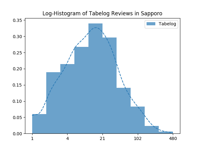
사실 50개도 많은 거였고, 대체로 20개 정도의 리뷰를 받는군요.
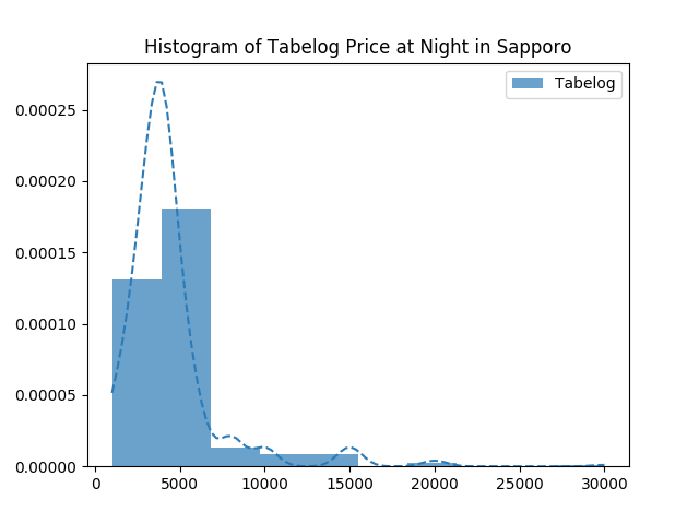
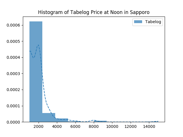
가격대
가격대도 리뷰와 패턴이 비슷한데, 대체로 중저가대의 음식점들이 많고, 비싼 식당은 적군요.
plot_dist(columns=['price_noon'],
          labels=['Tabelog'],
          colors=['#2c7bb6'],
          include_missing=False,
          do_log=[False],
          title='Histogram of Tabelog Price at Noon in Sapporo')
plot_dist(columns=['price_night'],
          labels=['Tabelog'],
          colors=['#2c7bb6'],
          include_missing=False,
          do_log=[False],
          title='Histogram of Tabelog Price at Night in Sapporo')
평점과 평가 갯수의 관계
그렇다면, 평점과 평가는 어떤 관계가 있을까요? 평가가 많은 가게는 평점이 높을까요, 낮을까요?
import matplotlib.pyplot as plt
import numpy as np

from matplotlib.lines import Line2D
from matplotlib.colors import Normalize
from matplotlib.cm import get_cmap
from scipy.stats import norm, linregress

def plot_scatter(columns, labels, title, log):
    # 데이터에서 결측치들을 빼버립니다
    filter_col0 = google_tabelog[columns[0]] != -1
    filter_col1 = google_tabelog[columns[1]] != -1
    data = google_tabelog[filter_col0 & filter_col1]

    # 필요하면 데이터에 로그를 씌웁니다
    x = np.log(1+data[columns[0]]) if log[0] else data[columns[0]]
    y = np.log(1+data[columns[1]]) if log[1] else data[columns[1]]

    # Scatterplot
    # 만일 산점도에 색으로 또다른 데이터를 표현한다면
    # 색을 칠하는 과정이 필요합니다
    if columns[2]:
        # 데이터를 처리하고
        filter_col2 = google_tabelog[columns[2]] != -1
        data = data[filter_col2]
        x = np.log(1 + data[columns[0]]) if log[0] else data[columns[0]]
        y = np.log(1 + data[columns[1]]) if log[1] else data[columns[1]]

        # 데이터를 색에 매핑할 준비를 합니다
        # 히스토그램으로 연속적인 데이터를 구간화(또는 이산화)합니다
        c = np.log(1+data[columns[2]]) if log[2] else data[columns[2]]
        bin_edges = np.histogram_bin_edges(np.unique(c), bins=5)
        c_bin_idx = np.digitize(c, bin_edges, right=False)
        c_binned = np.array([bin_edges[i if i < len(bin_edges) else i-1] for i in c_bin_idx])

        # 산점도에 점별로 색을 다르게 지정하려면
        # Color Map과 Normalize 객체가 필요합니다
        # 데이터는 Normalize 객체에 의해 0~1 사이의 구간으로 Normalize되고
        # Normalize된 값은 Color Map에 의해 색으로 변환됩니다
        # Data -> matplotlib.colors.Normalize -> matplotlib.colors.Colormap
        cmap = get_cmap('rainbow')
        normalizer = Normalize(vmin=bin_edges[0], vmax=bin_edges[-1])
        path = plt.scatter(x, y, s=5, alpha=0.5, c=c_binned, cmap=cmap,
                           norm=normalizer, zorder=10)
        axes = path.axes
        # 화면상 보이는 코너들의 x, y좌표를 Axes 좌표계로 cache해둡니다
        x0, x1, y0, y1 = axes.viewLim.x0, axes.viewLim.x1, axes.viewLim.y0, axes.viewLim.y1

        # 범례를 커스터마이징합니다
        legend_elements = [Line2D([0], [0], marker='.', markersize=5,
                                  linestyle='',
                                  color=cmap(normalizer(bin_edges[i+1])),
                                  label='{0:.1f}~{1:.1f}'.format(np.exp(bin_edges[i]) if log[2] else bin_edges[i],
                                                                 np.exp(bin_edges[i+1]) if log[2] else bin_edges[i+1])
                                  )
                           for i in range(len(bin_edges)-1)]
        plt.legend(handles=legend_elements, title=labels[2], loc=(0.655, 0.11))
    else:
        # 편안하게 산점도를 그립니다
        lines = plt.plot(x, y, color="#404040", marker='.', markersize=5, linestyle='',
                         alpha=0.5, zorder=10)
        axes = lines[0].axes
        x0, x1, y0, y1 = axes.viewLim.x0, axes.viewLim.x1, axes.viewLim.y0, axes.viewLim.y1

    # Linear Regression
    # scipy 덕분에 간편하게 회귀분석을 할 수 있습니다
    slope, intercept, r_value, p_value, std_err = linregress(x, y)
    r_value *= r_value
    plt.plot(x, intercept + x * slope, color='#2c7bb6', alpha=1.0, linestyle='-', linewidth=2, label='fitted line', zorder=11)
    # 데이터에 로그를 씌웠느냐 말았느냐에 따라 텍스트를 다르게 보여줍니다
    if log[0] and log[1]:
        lingress_text = r'$\log y={a:.2f} \log x{b}{c:.2f}$'.format(a=slope, b='+' if intercept >= 0.0 else '-',
                                                                    c=np.abs(intercept))
    elif log[0] and not log[1]:
        lingress_text = r'$y={a:.2f}\log x{b}{c:.2f}$'.format(a=slope, b='+' if intercept >= 0.0 else '-',
                                                              c=np.abs(intercept))
    elif not log[0] and log[1]:
        lingress_text = r'$\log y={a:.2f}x{b}{c:.2f}$'.format(a=slope, b='+' if intercept >= 0.0 else '-',
                                                              c=np.abs(intercept))
    else:
        lingress_text = r'$y={a:.2f}x{b}{c:.2f}$'.format(a=slope, b='+' if intercept >= 0.0 else '-',
                                                         c=np.abs(intercept))
    plt.text(x=x0 + (x1 - x0) * 0.65, y=y1, s=lingress_text)
    lingress_text = r'$R^2={d:.2f}, p={e:.4f}$'.format(d=r_value, e=p_value)
    plt.text(x=x0 + (x1 - x0) * 0.65, y=y1 - (y1 - y0) * 0.048, s=lingress_text)
    lingress_text = r'$\epsilon^2={f:.3f}$'.format(f=std_err)
    plt.text(x=x0 + (x1 - x0) * 0.65, y=y1 - (y1 - y0) * 0.048 * 2, s=lingress_text)

    # x-hist
    # x축에 보여줄 히스토그램(사실은 Gaussian KDE에 의한 Density Plot)을 그립니다
    hist_height = (y1 - y0) * 0.2
    density = gaussian_kde(dataset=x)
    density_x = np.linspace(x0, x1)
    density_y = density.evaluate(density_x)
    density_y = (density_y / np.amax(density_y)) * hist_height + y0
    plt.plot(density_x, density_y, '--', color='#1a9641', alpha=0.7, zorder=9)
    plt.fill_between(x=density_x, y1=density_y, y2=y0, color='#1a9641', alpha=0.3, zorder=9)

    # y-hist
    # y축에 보여줄 히스토그램(사실은 Gaussian KDE에 의한 Density Plot)을 그립니다
    hist_height = (x1 - x0) * 0.2
    density = gaussian_kde(dataset=y)
    density_x = np.linspace(y0, y1)
    density_y = density.evaluate(density_x)
    density_y = (density_y / np.amax(density_y)) * hist_height + x0
    plt.plot(density_y, density_x, '--', color='#d7191c', alpha=0.7, zorder=9)
    plt.fill_betweenx(y=density_x, x1=density_y, x2=x0, color='#d7191c', alpha=0.3, zorder=9)

    plt.xlabel(labels[0])
    plt.ylabel(labels[1])
    plt.title(title)
    # 데이터에 로그를 씌웠다면, x축을 원래 스케일대로 보여주도록 작업합니다
    if log[0]:
        old_axes = plt.axes()
        old_axes.xaxis.set_major_locator(plt.LogLocator(base=np.e))
        plt.sca(old_axes)
        dx0, dx1 = axes.dataLim.x0, axes.dataLim.x1
        ticks = np.linspace(dx0, dx1, 5)
        plt.xticks(ticks=ticks, labels=['{:d}'.format(int(x)) for x in np.exp(ticks)])
    # 데이터에 로그를 씌웠다면, y축을 원래 스케일대로 보여주도록 작업합니다
    if log[1]:
        old_axes = plt.axes()
        old_axes.yaxis.set_major_locator(plt.LogLocator(base=np.e))
        plt.sca(old_axes)
        dy0, dy1 = axes.dataLim.y0, axes.dataLim.y1
        ticks = np.linspace(dy0, dy1, 5)
        plt.yticks(ticks=ticks, labels=['{:d}'.format(int(x)) for x in np.exp(ticks)])
    plt.savefig('tmp/{:s}.png'.format(title))
    plt.show()
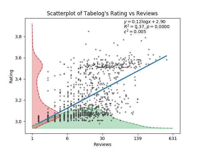
의외로 꽤 상관관계가 있어보입니다. 의 값도 0.37로 아주 낮은 건 아니고, 시각적으로도 평가가 많으면 많을수록 평점도 높아보입니다. 제 추측으로는, 평가가 많다는 건 사람이 많이 간다는 간접증거가 될테고, 사람이 많이 간다는 건 그만큼 맛이 있기 때문이 아닐까 생각합니다만, 반박의 여지도 많은 추측이긴 합니다.
사실 정말 알아보고 싶은 건 ‘평가가 많은 식당의 평점은 잘 변하지 않는다’입니다. 이걸 알고 싶은 이유는, 평점이 잘 변하지 않는다는 건 그만큼 많은 사람들이 그 평점에 동의한다는 뜻이라고 생각하기 때문입니다. 즉, 그 평점은 믿을만하다는 것이지요. 그런데 이를 알아보려면 평가의 수의 시계열 자료와 이에 대응하는 평점의 시계열 자료가 필요한데, 이는 정말 구하기 어렵습니다. 서버를 띄워놓고 크롤링이라도 해야 할까요. 아쉽지만 이 연구는 다른 누군가가 해주지 않을까 생각하며 포기해야 할 듯 합니다.